


Marketing an online business these days takes a lot of work, am I right? Whip up that ideal customer avatar, show up in those Instagram squares, write the blog posts, get to those networking events, and oh don’t forget, now you need to grow an email list.
Here’s the thing, all of those marketing efforts are indeed a good thing. They do the job of increasing visibility to your brand, establishing trust and affinity with your business, and bringing people to the door. The door being your website.
But visibility isn’t the end of the marketing road. Once a potential customer lands on your website, it has the responsibility of carrying that lead from interest in your offering, to intrigue about your approach, to excitement that your offering could solve their need, and finally to converting that potential customer into an active lead in your inbox.
Put simply: Your website needs to convert.
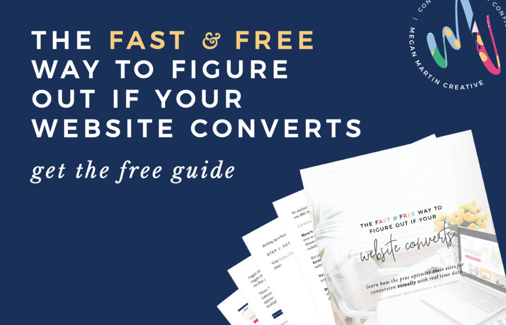
(Wanna learn how the pros optimize their sites for conversion visually? Download the free guide here!)
You can spend dollar after dollar on the latest marketing course and countless hours curating the perfect Insta grid, but if that traffic doesn’t convert into actual paying customers, “Houston, we have a problem.”
Let me ask you a question:
Do you confidently know that your website will convert your ideal customer into an actual paying customer?
If the answer is either a “Hmm… maybe?” or flat out, “No,” no shame, girlfriend. We spend too much time in the creative industry focusing on visibility and aesthetics and not enough time talking about how to close the deal.
So whether you pulled up your bootstraps and DIY’d your entire site a la HGTV style or handed the task over to a design pro, I want you to have the confidence to know that your website isn’t just another pretty face, but is actually setup to convert those dreamy ideal clients.
And it all starts at the beginning: Your Home Page. Set it up right, and you’re one step closer to booking more clients. Throw Home Page spaghetti at the wall and hope it sticks? Well, let’s not do that. 😉
The Boardwalk Real Estate of Websites
One of the biggest mistakes I see time and time again on websites is a home page that falls short of doing one of the most important jobs of the entire site: convincing a viewer to stay longer than 3 seconds. And then getting them to take action in the next 2.
5 seconds. It’s kinda sorta actually really really quick.
Unfortunately, a lot of website design effort is misguided towards creating something pretty. A pretty logo. A pretty navigation bar that fits just right. A pretty (giant) slider that shows off the latest and greatest work. It is all pretty.
I like pretty, too. But pretty is a dime a dozen. Pretty primes, but it doesn’t convert alone.
So along with the visuals, we have to think about our website as a journey in logical steps. And the journey starts above the fold right on the home page.
When you visit a web page, what you see first and foremost before scrolling is what we call “above the fold.” Think of this space as the Monopoly Boardwalk real estate of websites.
What you put above the fold matters. And what you leave out could end up costing you big bucks.
The two most important things that need to go above the fold are:
-
- A clear and concise statement of what your business does and who it serves.
- A prominent and goal-oriented call to action to get a 2nd click.
A Clear and Concise What and Who Statement
The golden goal of marketing isn’t to get millions of people to follow you or visit your website. It is to get the right people to follow you, visit your website, and quickly know that your business will solve their needs and desires.
Enter a clear and concise statement of what your business offers and who it is for. This can come in the form of a tagline, phrase, or simple sentence, but the key is that it should be quick and easy to digest. Remember, you’ve got a mere 3 seconds to convince someone they are in the right place. Keep it short. Keep it sweet.
And use words that convey emotion to connect your ideal customer to your offering. For example:
A Typical Heading: A Wedding Planning Firm Serving D.C. Couples and Beyond.
Why It Is Weak: Although it does tell us what you do (Wedding Planning in D.C.), it doesn’t strongly convey who you serve. “D.C. couples and Beyond” is akin to saying every bride and groom in America. And while you and I know that you can serve lots of kinds of couples, when it comes to conversion, you will find much better success in narrowing down your ideal customer right in your header copy.
Do you really love clients who aren’t afraid to step out of the traditional box and seek adventure? Tell them above the fold! Let them know they are absolutely in the right place and you are the wedding planner for them!
A Better Heading: A D.C. Wedding Planning Firm for Couples who Believe in Little Surprises and Big Adventure
Why It Works: This statement quickly makes the viewer make a decision → “Do I love little surprises and am I adventurous?” If the answer is yes, you’ve immediately hooked me and and have me intrigued enough to find out how your unique approach to wedding planning fits someone like me!
Bringing It Full Circle: Remember how I said pretty primes? This is how we bring it full circle. The visuals that surround your What and Who Statement work to strengthen the message. If you especially enjoy boho loving adventurous couples, your colors, fonts, graphics, and imagery should all come together to tell your brand story cohesively.
Pro Tip: Make the What and Who Statement stand out. It is more important that your potential ideal customer quickly knows they have landed on the right website than anything else in the first 3 seconds. Once they are convinced to explore more, they will naturally take in your beautiful logo, the stunning imagery, and all the little intricacies of your website design!
A Prominent and Goal-Oriented Call to Action to Get a 2nd Click
Okay, so she’s clicked to your website (from Insta or Pinterest or Google or wherever. That was the 1st click!) and you’ve convinced her to stay with a clear and concise What and Who Statement. Now you’ve got 2 more seconds to get her to the most important next step.
I’d tell you what that is, but I don’t have the answer. There is no exact recipe for where you should lead your potential customer. Only you can tell me what that step is!
Promise I won’t leave you hanging. 😉
To determine the next logical step, your website needs to have a main goal.
Is your main goal to book 12 clients this year? Then you might consider a prominent call to action button pointing your viewer to your services page where you go more in-depth about your unique approach, how your offerings can solve their needs, and testimonials from past clients to backup your claims.
Or maybe you’re finally working on growing an email list? Then an enticing call to action to get them to sign up for your newsletter would help you make that happen!
The point is, you don’t want to leave your now intrigued potential customer to figure out what to do on their own. It is your job to show them where to go. To tell them exactly what action to take. Give them the next logical step to take in the journey of your website and brand that will eventually lead to achieving your main goal!
Note: There is not a hard and fast rule on how many calls to action you should or shouldn’t have above the fold. You’ll see many business owners (including myself!) who have multiple CTA’s straight out of the gate on their home page. You can certainly have more than one, but each CTA you introduce into your website should be tied to a very specific goal. Put too many, and your potential customer might get decision fatigue and exit your site. Start with one main goal-oriented CTA and see how it goes!
Did you catch the word prominent?
Of course you did you savvy gal!
Something that is prominent stands out to be easily seen. It is particularly noticeable.
I bet you can guess where this is going…
Your call to action button needs to STAND OUT.
Think about stop signs. They are big, bold, and call you to a clear action: STOP. Your call to action button should be easily seen and easy to understand. They should stand out from their surroundings and be on the bolder side of your design. This is the one time in your brand design that it is a-okay to go bold and even veer a bit outside of your color palette if you have a super soft look.
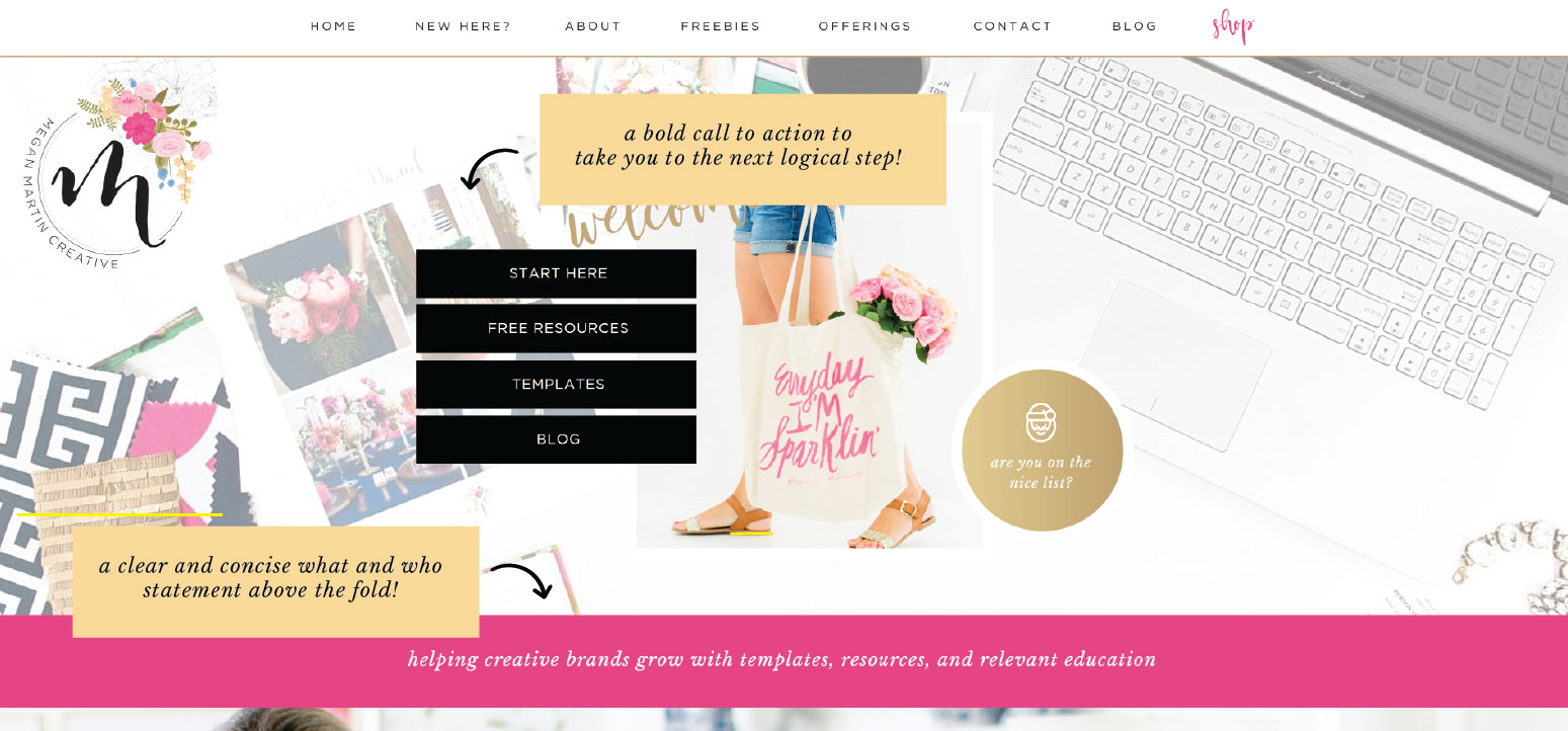
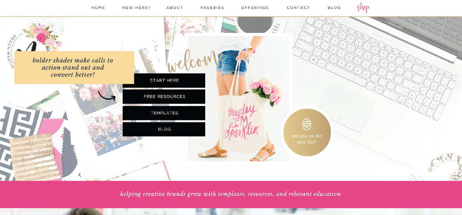
Take a look at the examples below from my home page. The first call to action button color is too soft (especially considering the rest of the page design and colors present!).
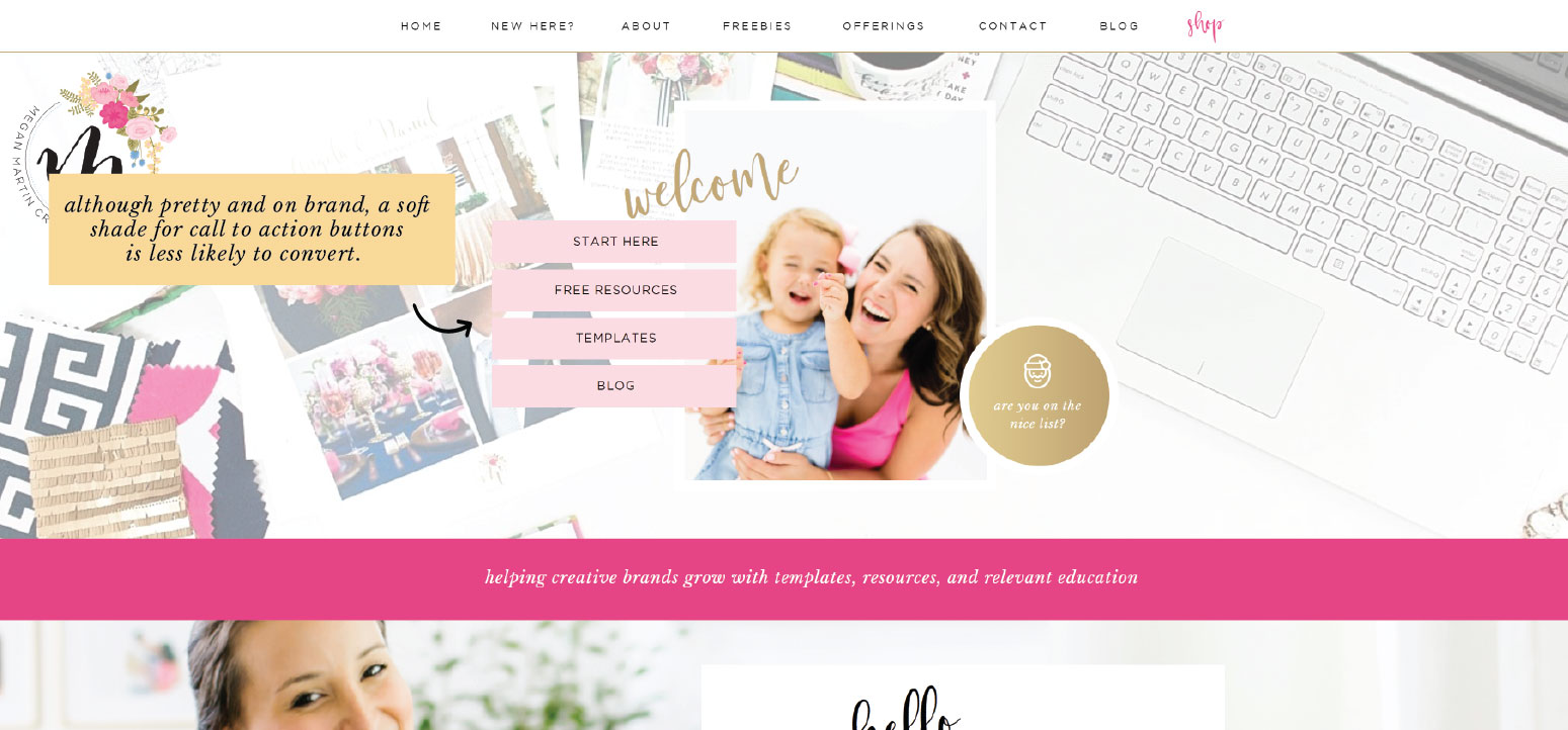
Statistics show that bolder colors perform better for call to action buttons. Now the CTA is prominent and draws the eye to read the the button!
Once you officially convince a potential customer to stay and get them to take the next logical step in the journey, it’s time for the rest of your website to lead them to the sale!
If you’re curious to know whether or not the rest of your site is teed up for conversion, download the free guide!


For service-based business (I’m a professional organizer) who primarily serves people in their local region, but also do online work, what would you recommend as the main CTA?
My main goal is to get people to hire me! But going straight to the contact page seems too direct- a viewer doesn’t yet know if they like me or my services directly fit their needs.
If it was just local work, I would direct the link to my services page. But I have two service pages- one for local, one for virtual.
Great question, Melissa!! If you have an opt-in / lead magnet for potential clients I would have the CTA be that! Maybe a big pain point they have or an FAQ? If not, then I’d make the CTA go towards your services page so they can find out more about how you can help them! 🙂